Hi everyone! It's Monday and that means its time to share the MDS Monday sketch with you! This week we have a card sketch by Tara! I went very bright with my take on the sketch. I have been using a lot of vintage or grunge or rustic looking papers and accents lately, so I decided to go bold this week. I used papers from the Anchors Away download kit, which is loaded with great elements by the way. Head on over to the MDS Monday site and see what the other design team members came up with. I love how everyone goes in different directions, it really highlights all that you can do with MDS!
Here is the sketch!

And here is the Anchors Away download! Lots of great papers here! I also have a hint for you. When making a card or smaller project in MDS, I noticed that when adding a background paper to the project, I couldn't manipulate the paper to get the section I wanted. Sometimes a paper has a large pattern and I want to be sure a certain part shows up in the background. When you add paper to a punch, you get to move your cursor around on the paper until you get the part of the paper you want to appear in the punch area. So, if the paper I want to add to my card has an area I want to highlight, I add a punch the size of the card so that I can move the paper.
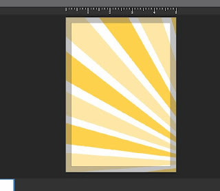
Here is what you get when you add the paper as a background paper. I wanted more of the sunburst to appear, basically using the right lower corner of the paper. Because I added the paper as a "Background paper", I can't move it around.

By adding the paper in a punch, you can zoom in and out, and also move the highlighted box around until it looks the way you like.
Thanks for stopping by! Now head on over to the MDS Monday site and see what you can do with the sketch!


LOVE your bright card! The rays caught my eye right away - so happy and cheery, Beth :)
ReplyDeleteI love your card, Beth. It would make anyone's day. Thanks for the tips on the background.
ReplyDeleteThis is so bright and fun, Beth! Thanks for the tip about the background too - I gotta remember that - to use punches!
ReplyDeleteLove your card, especially the sunburst!!!!
ReplyDeleteI still have this download on my list... great job with the details... especially the main panel. I have such trouble making a card that doesn't look boring with a plain digital image.
ReplyDeleteThis is such a fun bright card.. It just makes me Happy.
ReplyDelete