Monday, October 27, 2014

Making Apple Pie

Hi Everyone! It's time for another sketch for MDS Monday!! This time Jeanna is hosting the sketch challenge and she has us using lots of photos and accents.  I often have events with a lot of photos so I really like these sketches that allow you to fit a lot in.  For my page I used the Seasonal Snapshot Project Life download for most of my accents.


 Here is the sketch!  Head on over to the MDS Monday site and see what the rest of the design team has come up with, then give the sketch a try of your own.  We can't wait to see what you come up with!


Thursday, October 23, 2014

Planting the garden

I completely forgot to post my MDS Monday challenge this week!  oops!  Here it is a few days late! There is still time to play along, I hope you will give the challenge a try.  Yapha has created a fun sketch and askes that we try to use some grouped photo boxes on our page. 


Here is Yapha's sketch! Fun right?


 I did the sketch pretty exactly the first time and then did it again but I changed up the photo boxes to cut the kids up a bit less. It is so easy to make a few changes when you are working in the digital world! 
Head on over to the MDS Monday site and see what the rest of the design team came up with!

Tuesday, October 14, 2014

Weekly Deals

Hi everyone! I just thought I would share the digital deal of the week.  It is called Spooky Treats and you get 7 digital papers, 15 stamps and a digital punch.  You also get a pre-made treat wrapper template.  These are fun for Halloween parties and pages.  And, its all on sale for $7.77 this week! See it here

Monday, October 13, 2014

MDS Monday sketch #86 herringbone

Hi Everyone!  It's MDS Monday time again.  Heidi is the hostess and she is having us try out a herringbone technique on our page.  I have not tried this before so it was fun to take the challenge. It took a little bit of time but was very simple and there are several videos that you can look at to make it even easier.  Here is a link to the one I watched.   The video is a few years old so the MDS desktop looks a bit different that how it looks today but the punches and techniques are still the same so the video works nicely.  Heidi has also given some tips and tricks on the MDS Monday site, so head on over there and see what the rest of the design team has come up with.  We hope you will play along!


Here is my take on the sketch.  Since  I used my grandfather for a sketch a few weeks back, I thought I would use a photo of Grandma this time. 


Thanks for stopping by!


Friday, October 10, 2014

Monster Munchies Download

Hi Everyone!  I wanted to mention that the "monster munchies" download is on sale this week!  I really like this download for its distressed papers and fun stamps.  Take a minute to look at this download.  Be sure to click on the magnifying glass so you an see all that you get.  I have used the papers for backgrounds many times and the fun embellishments for treats.  Check out my Cupcake toppers!


Thursday, October 9, 2014

a not so spooky Halloween

Hi everyone.
While looking though my templates for the MDS Monday challenge this week, I found so many that I wanted to use.  This is a card template that I think came with the bitty bat digital punch.  I looked in the online store and it doesn't show that that is where it's from, but that is the label it has in my MDS program.  But, if you don' t have the template it doesn't matter because you could easily recreate the card on your own.  The original card was old olive and black but I changed it up a bit to make it have some pink for my little cheerleader.  This would make a cute postcard to send to the grandparents, don't you think?  This picture is from last Halloween, but I will have to get my kids to put their costumes on a bit early and take a few photos to send out, too cute! 


This is what the original looked like. Check through your templates and see what you have, I am sure you will find some great cards or pages that you can switch up and make your own. 

Wednesday, October 8, 2014

Simple Sketch

Hi everyone!  I am playing around with some old page sketches I had saved in my computer.  Today I decided to make a page with a few of the pictures I found in my camera after letting my son David play around with it in the pool on our vacation.  Ben bought me an underwater digital camera when we went to Hawaii, and it is really fun to use.  I guess David couldn't resist taking a few selfies with it!


Here is the sketch...
why not page a page too?  and send me a link, I would love to see it!

Monday, October 6, 2014

Use those pre-made templates!


There are so many great pre-made templates in My Digital Studio, it seems a waste not to use them.  Today Holly has a challenge for us at MDS Monday to use one of the pre-made templates but change it up a bit to make it yours.  It was seriously hard to choose a template as there are just so many great ones.
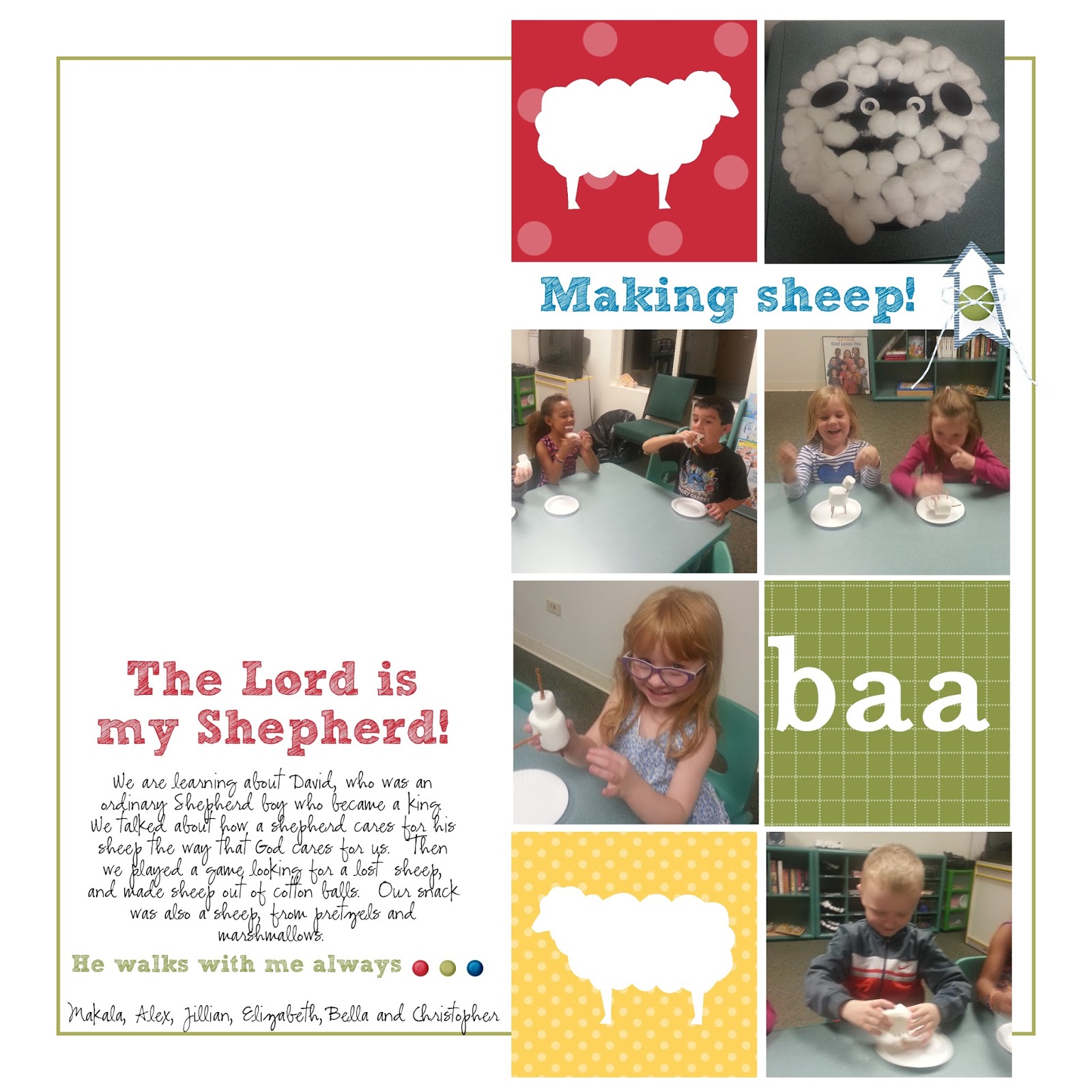
I needed to make a page for my Religious Ed class to feature a couple new children that are not in older pages.  Funny how they notice these things.  As some of the kids have gone on to the 1st great class, I have a couple new kids in my kindergarten class and one little girl noticed right away that she wasn't in any of the pictures on the wall.  I hang pictures of class and then after a while I put them in our class scrapbook.  They really seem to like to look through the book and remember the things we did, and I think it helps them remember some of our stories as well. 
So, here is the premade template before I switched it up..
The photo boxes don't show up since I didn't add any pictures but I kept the photo boxes in place.   I changed the papers, not sure why, maybe I thought it was just too easy, and I changed the stamps to work with my theme.  Seriously a page completed in under 15 minutes! Crazy right?  I think it took longer to decide on which template to use. 
Head on over to the MDS Monday site and see how the rest of the team is changing up their templates, then give it a try of your own!  Did you know you can resize pre-made templates?  You can!  If you find one you like, but it is a 6 x 6 and you want a 12 x 12, you can change it with the edit feature!  you can even change 8 1/2 by 11 into a square, it's a little trickier, but very doable, so look through all your templates and find one you like.  If you would like to learn more about how to resize your pre-made templates, go to this blog post where I go into more detail on this subject. http://bethsdigitalcuts.blogspot.com/2014/08/editing-pre-made-template.html
Thanks for stopping by!!


Wednesday, October 1, 2014

Faster Fall Leaves

Hi everyone!  Last week I showed you a fun fall card with the French Foliage stampbrush set.  Well, that card had a lot of steps and things to cut out and well, took some time to make.  Some of you may like digital cards for their simplicity and so I thought I would make another fall leave card, but this time make simplicity my rule of the day.  What could be simpler than this?  These fun leaves are already colored, sized nicely and co-ordinate beautifully.  I just put them on the page, rotated them a bit and added an acorn and sentiment to the bottom.  After I printed the card out I added a button and some linen thread.  Easy Peasy!


I like to cut my panels out 1/4 inch smaller than the card base and then pop them up on dimentionals to make them less flat and give them a more finished look.