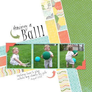
 Like yesterday's Lego page, this one has a lot of white space too. I really like the look of a white background sometimes.
 I originally had this page finished, except the text box, because I couldn't decide on a font (sometimes that's the hardest part!!). But then Tuesday morning came around and the new downloads came out, and I just had to switch the papers. Luckily this is a digital page, so switching papers is just a click away. I love the green and blues in this paper. It looks so nice with the grass.
This page is for the Scrap Map 4 challenge over at Mydigitalstudio.net
Here is the Scrap Map. A fun layout, I think. I have a tip for you when you are trying to copy a page layout. Click on the image of the template. Save the image as a picture. Then, when you open MDS, add a photo box to your page and size it as the whole page, for example, on this page I would open a 12 x 12 page, and add a 12 x 12 photo box. Then plunk the template picture in the photo box. Add your punch boxes and photo boxes right on top of the picture. This way you know where to put them, what size, what angles, etc, and you don't have to keep minimizing your work to look at the template. When you have all the elements on the page, delete the 12 x 12 photo. Add your background page last so you don't cover up your template photo. Did this make sense? Its easier to show than explain. I learned this from another Stampin' Up! demonstrator named Martha Inchley. So clever of her!
On this example, I added a scrap map to the open 12 x 12 page.
Here I have started to layer the punches onto the page. You can leave them grey while you are working, I added papers so that you could see them better.

Still adding elements to the page.
 When you are all done, click on your layers button. That is the one that looks like this..
Then the box on the left will pop up. Your photo should be the very bottom layer. drag it up to the top layer, then click OK. Now you can simply click on it and delete it.
Thanks for stopping by!! As always, let me know if you have any questions, I am happy to help.


.jpg)
.jpg)
.jpg)
.jpg)
.jpg)
.jpg)


.jpg)


