Monday, December 31, 2012

Making Cookies

Making Cookies with my daughter was so much fun this year.  She was able to do each step by herself and was very proud of her finished gingerbread men.  One of my New Years Resolutions is to include myself in more of my Scrapbook pages.  I never do, and years from now when my children get these books, they will have no pictures of me.  So, even though I am still in my pajamas and have no makeup on, I included the picture my husband took that morning.  Another resolution is to go on a diet so that I look better in my photos :) 

For this page I used papers and embellishments from the Homestyle Happiness download, perfect for Christmas pages. 
#132192

#136520
I also used the gingerbread man from the Homemade Happiness template page.
The ornament shapes are digi punches from the Holiday ornament keepsakes kit. (#131360)
Thanks for stopping by today!


Wednesday, December 26, 2012

Featured Sample

My page was a featured sample at MyDigitalStudio.net today!! yea!  that was so fun to see! I love all the samples there and am so happy to be featured!  check it out!!

Thursday, December 20, 2012

Love those smiles!

I found yet another My Digital Studio challenge group!  YEA!  This one is on Facebook, and is called "Simply My Digital Studio Challenge".  I some how stumbled upon it the other day, and it was started by some other Stampin' Up! demonstrators who's digital pages I really love so I am glad I found it.  They post a challenge each week, I think on Monday.   So, a few weeks back they had a challenge on using multiple photo boxes grouped together, somewhat like the challenge at My Digital Studio Monday a few days ago.  And then last week they had a challenge on using cropped embellishments or cropped stamps, basically just having you learn to use the cropping feature.  So this page combines both of the challenges in that I grouped three photo boxes, and I also cropped an embellishment.  The XOXOXO used to be all in a line, but I cropped it down to just XO, and then copied that two more times and lined them up underneath each other.  I really like the end result.   Hope you do too!  Let me know if you have any questions! I am happy to help. 

Wednesday, December 19, 2012

My Digital Studio Monday Challenge

I made this page for the My Digital Studio Monday Challenge for December 17th.   It may seem familiar to you if you've been looking at my blog for a while, and that's because I decided to make it match the page I made a few weeks back.  The pictures are from the same visit with Grandma, and I thought they would look nice opposite each other in my album.   I used to feel that everything had to be a two-page spread.  In my mind you had to look at both pages at the same time, so that meant that they needed to be about the same event and go together.  Thankfully my thinking on this has changed.  Another blogger, and I can't remember which one as it was a couple years back,  pointed out that in a 12 x 12 page layout, your eye really only looks at one page at a time.  I thought about this and got out my books and she was right.  I needed to get over my matching hang-up.  I am glad I did too because there are so many times you only have enough photos to make one page, and those photo's would sit unused because I wasn't sure what to do with them.   Anyway, enough on that.  Here is the sketch:
 
I like the grouped photo boxes at the top that contain one picture.  There is a video on this at the main My Digital Studio website.
 It's a fun technique, I'm sure I'll use it many times in the future.  Here  is another page I made using that technique a while back.
Thanks for stopping by! 


Sunday, December 16, 2012

Reindeer Day!

It was so much fun to go to my son Zachary's Reindeer Day!  Mrs Cortez has so many cute projects for them to make and I loved the Reindeer hats!!  So Cute!  The kids had a blast. 
I showed my son the page I made and he said that he liked it, and that the reindeer at the top was really cute.  So glad he liked it, the reindeer was probably the hardest part of the page :)  and the page was super easy.  I made it this morning because I woke up sort of early for some reason. I couldn't fall back asleep, so  I made some coffee and got on the lap top.  Reindeer day was just two days ago and my page is already done.  How great is that!
One of the new features of MDS2 is the ability to color in the stamps with multiple colors.  Here is a step by step tutorial if you haven't tried this yet.


Step one, chose your stamp.


 Step two, change its color to the color you will use the most.


Select the Coloring tool from the menu on your right hand tool bar.


Your stamp will pop up in to a new box. 


You can change the brush size, you can zoom in, and you can reset if you want to start over.
 
I zoomed way in to do the dots on the scarf.
Done!!
Thanks for stopping by!


Saturday, December 15, 2012

two page spread


The other day, (too long ago I know!) I posted a Christmas page for a Challenge at MDS Monday.  Well, I wanted to add a matching page because I had a few more pictures that I wanted to add.  The quickest way to do that is to Insert a duplicate page.  There is a little button on the top tool bar, look for "insert" and then you will get a drop down menu with a few choices.  For my project I chose the "insert duplicate page mirrored".    Then I delete the photos and add  different ones.  Easy!  I, I know my lines will match up.  The only tweaking I needed to do was flip my papers because they had words on them, notice the fa la la?  Well, they looked like al al aF :)   also the red has a bit of  HO HO that read OH OH.  So, I clicked on the papers and hit the flip button.  Done! 


Friday, December 7, 2012

Another Christmas page

Today's page shows the kids decorating for Christmas.  Last year I did it all while they were at school as a surprise, and it ended up that the surprise was on me as they were a bit upset that it wasn't a group effort.  So, this year I let them do it all.  David was happy to do the lights and place the star.  Jillian and Zachary did the ornaments, which means that the bottom half of the tree has a lot more ornaments than the top half :)  I've decided that I need to let that go and let them be proud of their tree. 
This page was also designed by Heather Summers, it was so cute I left it almost completely the same as hers. 
My hint for you if you end up using the stocking punch, make the whole thing in the size it comes up on the screen, put it all together, then group it all.  After you have it all grouped, then you can go ahead and resize it and turn it and put it where you want it.  It's harder to line up if  you resize it before you've put the toes and heels and top on.

Wednesday, December 5, 2012

Grandma's Christmas Decorations

This page is for the second challenge over at MDS MONDAY.
I love sketch challenges, they help kick start a project.  The papers and elements for this page are from the Jingle and Joy kit.  The page is also inspired by Heather Summers, who used this kit in class a few weeks ago, her class always gives great ideas, like the digital tape behind the Hello Christmas so that it stands out and so that the dotted paper doesn't distract the title.   I did the same thing with the snowflakes on the ribbon.  The snowflakes were really cute, and I wanted to add them as a border, but against the patterned paper they just didn't look good, so I added a Very Vanilla ribbon behind them and they work great. 


Here is the sketch from the challenge.  Why not give it a try?


Thanks for stopping by!

Saturday, December 1, 2012

Christmas Postcard

 I have been working on some Christmas cards for this year and I decided to do them in My Digital Studio!  I choose 5 by 7 postcards for this year, they come with nice envelopes and are less expensive than a card that opens.  You get to completely design the front and back.  Here is the first style I made, pretty traditional.  I made the front like a scrapbook page.  The postcard uses the papers and Embellishments from Winter Wonders and snowflakes from Jingle and Joy.
Here is the back.


Here is the second postcard, a bit more fun with a chalkboard background and the  kids making Grinchy faces. 


This is the second side.
Thanks for stopping by!!

Thursday, November 29, 2012

Scrap Map 3 and Finding Valor

photo by Kate Lema Photography

 
Another challenge sketch.  This is for the MyDigitalStudio.net scrap map 3 challenge.  Finding Valor is the name of my nephew Jake's band.  They took some new promotional photos and I think they look great.  The papers are from the Grad party download.  The splatter stars are from the Oh Splat download.  Frame and stitching are from Downtown Grunge.   I really like the text on a path feature of MDS2, that's how I made the Title go in a half circle.  There is a how to video on how to do the text on a path feature that is better than any explanation I could give.  You can find it here.
Thanks for stopping by!!

Tuesday, November 27, 2012

A Free Download From Stampin' Up!

Stampin' Up! has released another Free download!  This is a cute tag.  I would go nicely with the Grinch candy bars I made on my paper blog monday!  The item number is 132810 it comes up free in your shopping cart.  Go to my Stampin' Up! website, click shop now, and add this number to your shopping cart.  There are some other really cute matching tags and a new kit called  Jingle and Joy that is really cute, lots of cute papers and some really cute stamps and embellishments.  I realize I'm using the work cute a little much, sorry :)   One of the downloads is just so crazy that it too might just be cute. Can't decide.  I may just have to get it and see if my husband notices it hanging on the wall.  Its a template for a 3D reindeer head.  So crazy its cool?  or just crazy?  you decide! Here are pictures of the other new downloads from today, not free :)


Monday, November 26, 2012

MDS Monday!

I found a new blog this week!  I love sketches to help me start a scrapbook page, so this website is great for me.  It is called MDS Monday!  Here is the link.  They will post a sketch every other Monday I believe.  You can see the team's take on the sketch, and try one of your own.  If you like, you can even add your page to the blog.  This is the first sketch, the blog just started.  Here is my take on it.  This is my son Zachary on Bob's tractor in Iowa.  We went to Iowa for Thanksgiving this year and my mother in law lives on a farm of sorts.  Zachary loves to explore all the farm implements and look for kittens in the barn.   This year the tractor was out and he loved it, I had to pry him off.    I used papers from the Grad Party kit for my page, the frame is from Downtown Grunge, and the cute tractor stamp is from the On the Go stamp set. I also added some splatters to my page,  Zachary did get awfully dirty on the farm :)
This is the original sketch.   Check out the MDS Monday website!  I added it to my Favorites and will be checking back each week to play along!

Tuesday, November 20, 2012

Kindergarten Feast


I had a great time at the kindergarten feast on Friday!  There were 20 kids, 15 boys, all happily enjoying a party at school.  I was a helper at one of the craft project tables.  It was a crazy two hours but so much fun.  And Zachary was so happy to have me in the classroom.   The page layout was from the online class I'm taking with Heather Summers and Martha Inchley.  I switched out snowflakes for leaves.  The papers are all from the "Wonderfall" download, which also includes the fun leaf punches.  The tag is from "Family Fun".
Thanks for stopping by!!

Sunday, November 18, 2012

Online Extravaganza

MyDigitalStudio2 is on sale this week!!  50% off!  If you have version one, get the upgrade half off too!   This would be a great Christmas gift for yourself  so you can make saving memories your new years resolution.  contact me if you have any questions! 

Friday, November 16, 2012

PLACEMATS!!

One of the new features of MDS2 is that we can make projects in custom sizes.  I wasn't sure exactly what I would use this feature for until I started taking another online class.  I love these classes because even though I feel pretty comfortable with My Digital Studio, I am constantly learning little tips and tricks I never knew.  Here is a link to the class I am taking in case you would like to join in.  It already started but you can join anytime.   Anyway, in this class we were shown how to make these really cute place mats!!  They
are 11 by 17 inches, "Ledger" size.  I made them very quickly and then ran straight to Office Depot to print them out and have them laminated.  You can also send them online to be printed, but there is an Office Depot right down the street about a mile away, so I just went in, and I had a coupon :)
Aren't they cute?  I had two thicknesses of laminate to choose from and I choose the 10 mil thickness.  Very strong but more expensive.  They were $1.18 to print in that size, and the laminate was another $4, so just over $5 each.  If you go with the thinner laminate, it saves you $2.00. 
Fun.  I am so happy with the finished product that I am going to make a few non Holiday ones as well, and one for my baby niece. 
To make a custom size choose "custom" in your start up menu.


Next enter in the size you want to make your project, then click "create project" and the custom sized canvas will appear.
When I was finished I exported the pages to a thumb drive and drove over to Office Depot.  You can go to Staples or Office Max too.  I here Staples is less expensive, but as I mentioned, Office Depot is just down the street so that's where I go.
 
Thanks for stopping by!!


Thursday, November 15, 2012

Snowday layout

I am just relaxing this week as my daughter and I are recovering from nasty colds.  So, a great way to spend the time is to play with My Digital Studio!  I have a nice hot cup of tea, a cozy blanket, and my laptop!! Here is a page I made today!  This page uses the papers from Frosty Day II.  I love the bright colors and they happen to go perfectly with the jackets on the kids!!

Tuesday, November 13, 2012

recoloring embellishments

Hi everyone!   I was thinking about Santa being back at the mall already and looked up older pictures of the kids with Santa.  Here are Jillian and Zachary last year.   When I finished the page I liked how it turned out, but wished that the trees matched the green background of the photo.  The trees are embellishments, not stamps.  Then, I remembered that we could recolor embellishments now with My Digital Studio 2!  YEA!  So, I used the recolor button, but it just gave me the standard Stampin' Up colors.  I noticed a "more" button at the left, so I clicked that, and happily it gave me a "Picker" option.  I picked some different shades for the photo to recolor the trees and now I as super happy with the end result! 


Here is how it looked before recoloring.  Also cute, but hey, if I can add more steps I'll do it :)    At least that's what the ladies at class say!

Friday, November 9, 2012

New Blog Headers!


I made some fun new blog headers last night!  I used the digital owl punch, so cute.  For the first on I used him as is.  I added a cute Santa hat for the season and a candy cane striped shirt.  The little snowflakes complete the scene.


On my paper crafts blog I changed the header too, but I made the owl into a turkey for Thanksgiving.  He took a few more steps. 
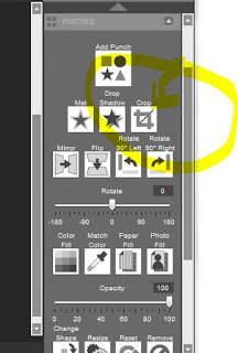
First choose the owl punch and apply him to your page. Next, choose the crop tool.  It is on the side bar to the right. 
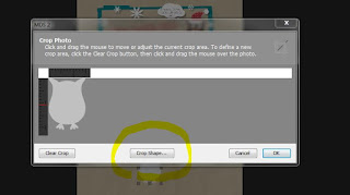
Next, click on "Crop shape".  This will then bring up your punch shape choices.  I choose the circle punch.


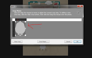
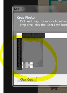
The circle then appears over your owl.  Move the circle around so that it cuts off the ears and expand it all the way to the bottom of the owl.  His feel get a tiny bit cropped but that's OK.  click the OK button and color him a shade of brown.  I choose Chocolate Chip.  Next you need that little thing that hangs off the turkey's beak.  The name is escaping me now, I want to call it a gobbler but I know that's not right.  Waddle maybe?  Anyway, add another owl to your page and select the crop feature.  This time you don't need a shape, just move the crop line to the feet area and highlight one of the feet.  Click OK.  Then color your gobbler (?) and move it over to the correct area on your turkeys face. 
 Rotate the gobbler till you like how it looks, then add your heart shape beak and eyes.  


You should now group all your elements so that you can move them all around as one piece.


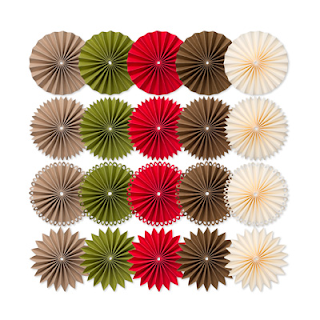
Now add your turkey feathers.  In my header I used the Rosette Embellishments, so I thought I would show the blooms this time.  Add your blooms to the page, then crop in half. Do this with as many colors as you like.  You can use the recolor tool to change the colors if you need to. 
 
Resize some of your blooms so that they layer nicely.  Group them together and add them to your turkey body. 
Wouldn't these make cute table place cards? 

Rosette download item # 131525 $3.95


Bright Blooms download item #130876 $4.95

 
 Thanks for stopping by!!  One of these days I'll learn to make screen capture videos and you can see the step by step better but I hope this all made sense.  Let me know if you have any questions!