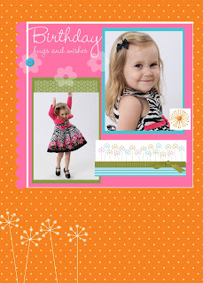
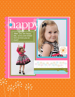
Here is the 12 x 12 version. The things I had to tweak are that I group all the page elements so I could move them up on the page. On the larger version there was a huge orange polka dot area at the top and the main element box ( that's what I'm calling the pink area and all the things on it, such as the pictures and the flower stamps and the ribbon etc) was all the same but at the very bottom of the page. Jillian's shoes were off the page entirely for some reason. So, I dragged all the elements up. Then I had to re add the white flowers at the bottom because they were gone. Maybe because they are hanging off the page in the 8 1/2 by 11 size, not sure. But anyway, I just had to re add them and that was it. So, now my 12 x 12 premade template page options have grown by leaps and bounds. And my card options too! I thought I would see what this template looked like as a card. I took off the "Happy" and replaced it with "Happy Birthday". I also made the green background above the jumping picture smaller.
 So, here is what it would look like as a birthday card. Just a tiny bit of tweaking and it was all done! Love this feature!
I'll post some other great features as I get to know them!!


No comments:
Post a Comment