Pages

Monday, June 30, 2014

MDS Monday # 72

It's MDS Monday time again!! Holly has a fun sketch for us this week.  Holly's sketched used a  speech bubble and lately the only speech I hear is Jillian singing " let it go" from the movie frozen.   I had a lot of pictures of her twirling around from a few weeks back, so this sketch worked out really nicely for me.  
Here is the sketch!
Head on over to the MDS Monday blog and see what the rest of the team has come up with.  And then give the sketch a try of your own!  We would love to see what you come up with!!


I used the Love is all around kit for my page.
#136821 $9.95


Wednesday, June 25, 2014

Weekly Deals

Did you know that Stampin' Up! releases new weekly deals every Tuesday?  Well they do and they almost always include a download.   This week includes a really fun summer time download that I have used several times in the past.  I Just love the red, white and blue and it is perfect for photos of family picnics or parades, ball games, you name it.  I guess that's why they call it the Summer Possibilities kit!
This kit has 12 fun papers and lots of embellishments.  Here are some of my past projects that were made with this kit.  A fun park page...
and a party invite from last year...
And I am sure I will use this kit a few times this summer as well!  A great deal at $4.77!!

Tuesday, June 24, 2014

Ombre Background in MDS

Hi everyone!  I know, it's Tuesday, and I am just now posting my MDS Monday page!  I thought I had scheduled it over a week ago but I guess I didn't.  Oh well, better late than never!  You may also recognize the photo, its the same one I used for the virtual crop last week.  I actually made this one first.  One of the many great things about creating digitally is that you can play around with a photo on many different layouts and see which one you like best. 
On to the Ombre effect.  I created this effect on my page with punches.  I added a 12 x 12 square and filled it with soft sky.  I reduced the opacity to 20%.  Next I added a 12 x 10 in punch and added soft sky again.  Layering the colors will give you a gradually darker effect as you go down.   You can play around with the opacity in your layers to get more subtle or more noticeable shades.  

Here is the sketch.  Head on over to the MDS Monday blog and see what the rest of the design team has come up with.  We hope you will give the sketch a try too! 

Thursday, June 19, 2014

Another virtual crop page!

This is another page from the virtual crop night on facebook.  We were working on the idea of "masking" which in stamping is an area you would cover up so that you could apply ink around it.  You can achieve a similar look in digital as well.  Here I added white circles on a white background. The "Drop shadow' acts as the ink I would have sponged around them if it were paper. 


Normally I leave the drop shadow in the default position, but in this case I changed just about everything.  I increased the blur, that is how large the shadow casts onto the page, I increased the opacity to make it darker, and I changed the color to make it Lost lagoon. 


I did a similar thing on this card here. I used a stamp and background in the same color, then added a shadow to the stamp to get those diagonal lines.  They give a look like that of an embossing folder if you had used paper.


And look, I was the "pick of the crop" winner for the page I posted yesterday!
here is the page in case you missed it...
Thanks for stopping by!


Wednesday, June 18, 2014

Last day of school

I joined in on a virtual crop last night on Facebook and this is one of the pages I made.  I got these photos from my son's teacher.  so cute!  Zachary had a great school year and really enjoyed his class.  It was so thoughtful  of her to take these and send them to all of us!  If you are interested in joining in on the next "virtual crop" let me know and i will get you all set up.  The virtual crop is run by Monika Davis and Cindy Schuster.  They post two challenges with a technique to try.  Joining in on challenges is a great way to get to know your software.  The more you use it the easier it will become.  You will get to know all the tricks, get to know what images you have and how to find them in your library.  This is a win-win because you will also make cute projects.  They can be cards or pages. And, while I am on the subject, you should also do my MDS Monday challenges :)  Hope to see you at one of these sites!  Let me know if you want an invite to the Facebook challenges!

Monday, June 16, 2014

MDS Monday # 70!

Hi everyone! It's Monday, MDS Monday of course!  This week Joan has a fun sketch for us to try! We are layering shaped today. Joan used circles on her sketch, so I used circles on my page, but you can use another shape if that works better.  This page features my daughter Jillian and her friend at the park last summer.  My friends husband is a park designer and needed some kids to visit a local park for the catalog photo shoot.  We were free, so we went along and now Jillian is in a park catalog! how fun is that?


   I hope that you will give the sketch a try.    You may have noticed that we have switched to page sketches instead of alternating between card and page sketches.  But, you can still do either and we hope you do.  We would love to have a nice variety of samples to show you.


Here is a card i made with the same sketch.


Head on over to the MDS Monday site and see what the rest of the team has come up with.


This is a card I made for the sketch.

Wednesday, June 11, 2014

MDS Monday #69 ~ Card Version!

Hi everyone!  This weeks MDS Monday challenge was just that, a challenge.  For me anyway.  I struggled with getting all the layers just right, but I was super happy that I kept at it because I just love my finished page!  At the bottom of the post Cindy Challenged us to give the sketch a try as a card as well and so I decided to do just that!  Here it is!! What do you think?  Once again I used the Hi There kit for this page, but I added some Balloons from the Patterned Party download. 


The problem with the balloons from the Patterned Party download is that they are see through.  Do you add a stamp only to find it wont work because it has empty spots that show your background?  Well, there is a fix for that.  You can add a freeform brush layer or you can add punches to cover up the areas that show through.


Since the balloons were mostly just ovals I decided to use oval punches.  I sized them on top of the balloon and then sent them back to behind the balloon.


See, problem solved!


Here is the page, in case you missed it!  Head on over to the MDS Monday page and see the samples!  I hope you give the sketch a try too!


Cousins Swtchbook

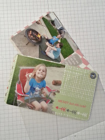
We were lucky enough to have some visitors over the Memorial Day weekend.  We got to see some cousins that we hadn't seen in a very long time.  The kids were all toddlers or very small the last time they saw each other.  It was really fun to see them play like old pals and get along so nicely.  I decided to make a little swatch book of the photos we took.  I love these swatchbooks because they are a fun way to share photos without just sending a stack of pictures or spending a long time making a large scrapbook.  You get 26 small pages to decorate and if you keep it simple and stick to one download kit, you get great results in very little time. 
I used the "Hi there" kit for this project.


I printed out 3 books, one for the cousins, one for my family, and one for Grandma.   I have made a lot of these gems in the past.  I made one of school day highlights for my son's kindergarten when I was room mom. So cute, so fun, and not too much fuss or cost!  A win- win!


The "Hi There" digital class comes with these papers and stamps, as well as 4 videos that teach you how to make some cards and a tag with the kit.  I think this is a fun kit for sure, you saw it on my blog Monday with the page I made for the MDS Monday sketch#69.   And, you will see it again next Monday for MDS Monday sketch #70, so check back!


Monday, June 9, 2014

MDS Monday #69

Hello everyone!  It's Monday again, and that means MDS time for me.  This week Cindy has a sketch for us and it is a fun one.  I really like the way she has us doing our title in the little Polaroid frame.  This sketch had me a bit leery at first, but I stuck with it and I am happy with my finished page!
Head on over to the MDS Monday challenge blog and see what the rest of the team has done with the sketch, then give it a try too!  We would love to see what you come up with!


Wednesday, June 4, 2014

Daisy Trio ~ more hybrid cards

Like most Stampin' Up! demonstrators, I am cleaning out my craft room to make room for new goodies and to sell some retired goodies. While clearing things out I found a page of digital stamps that I had printed a while back.  I didn't want them to get lost again, so I decided to turn them into cards rights away.

I made some square cards just for fun.  I really like the black and Summer Starfruit (just retired).  Try the new Hello Honey with black, I think that would look great too!


I printed the stamps out onto an 8 1/2 x 11 piece of water color paper, filling several on one page.  Then I cut them all apart to color.  I used my Aqua Painters to ad the color to the flower centers and to the shadow behind the flower.  The shadow was made with Crumb Cake.


Adding the shadow behind the flower really makes the petals stand out, they even look whiter than the background, which they are not in reality.  The Aqua Painters really allow you to add multiple tons to the coloring, like in the flower center.


Last one, the biggest flower.  I love that with digital stamps you can resize them.  Make a huge flower or a small one, its up to you!


These Daisy's are from the "Sweet Details" Photobook Template.  
You can also get just the stamps here for $3.95   
Thanks for stopping by!

Tuesday, June 3, 2014

New Downloads added

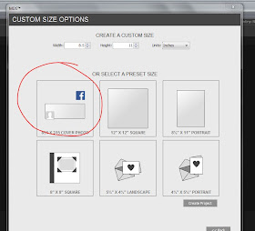
Hi all!  Just wanted to let you know that when you next go into your My Digital Studio program there will be a new update!  You may get a message that an update is available, and you can just go ahead and update from there.  If you don't get that message box, click on the help button and scroll down to the "check for updates" button and click that.  This update gives you the new In-Colors! Yea!  The will be added to your color pallet and to your card stock selection! There was also a new template added!  If you click on the "custom" button at your new project options, you will now see a "facebook" option!  This new option will allow you to design custom facebook covers! Fun for all you Facebook users. 

 Click on "Custom"


 Here it is.  No boring facebook covers for you, you will have a one of a kind! 


 There were some fun new downloads added yesterday too! .  Some are more of the Project Life digital downloads and they have some really great colors.  There are some other card downloads as well.  Click here to see the non-Project Life downloads.     To see the new Project Life downloads click here.
I wanted to point out a few things about some of the downloads that you may have missed.  When looking at a download you need to also read the description of what you get.  Sometimes a card is just a card template, other times you get the template and stamps and punches that were used to make the template.  For example, one of the new downloads is a baby announcement.  It is priced at $5.95 and you may think that is a lot for a card template when there are others that are only $1.95 (Baby Bumper shower invite for example).  Look at the descriptions to see what it comes with.  The new Proud Moment announcement comes with the template as well as an 80 piece stamp brush set.  Some cards are the template only.


Take a look at the Little Moments Project Life download.  There is really a lot there.
When you click on the little magnifying glass you get 7 pages!
Look at the description! 76 stamps, 204 cards.  If you saw my post from a few days ago you saw how you can use the cards for larger elements in your pages, like a whole background or a large panel, or use them as journaling boxes.


Look at that cute tooth!  There are some really sweet cards in this download. There are 4 pages of cards!


This is just one of the three photos of stamps in the Little Moments kit!


This is the Happiness Is Project Life download and it uses the new In-Colors! 


Thanks for stopping by!   Any questions please feel free to contact me!! 

Monday, June 2, 2014

Digi Grad Card for MDS Monday challenge #68

Hey everyone!  It's Monday, so that means MDS Monday for me!  This week Tara has a card sketch for us. As I was in need of some Graduation cards, I knew exactly what I was going to do.   The school colors are silver and blue, so I used Pacific Point Ribbon and Glimmer paper.  The newsprint paper is from the Modern Medley Overlays kit.

This card was super quick and easy and truly took me less than 15 minutes.  You can use the sketch as a great starting point and really add more details or go super simple.  We would love to see what you do with this sketch.  Head on over to the MDS Monday site and see what the rest of the team created.  Some made cards, some made pages, its all good!  Give the sketch a try and show us what you can do!!