I made those Lego bricks with, you guessed it, Punches! Punches are my Go To tool in both the paper world and the Digital world!
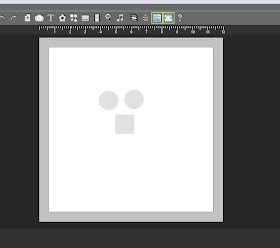
You start with a square and make it twice as long as it is wide. You also need two circles.
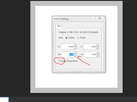
To edit the square into a perfect Lego brick, I used the editing tool. The first one I made I just stretched the square, but David told me that Lego is always exact, I guess they would have to be for the bricks to work together :) So, I redid my rectangle by right clicking onthe square to get the edit box. Then I went to the "W" and "H" (width and height) areas to make one of them double in size. You need to "unclick" the "keep proportions" box, or you'll just get a bigger square.
Next you need to resize your circles. I colored them in so that I could see them better. once you get one the size you want, you can right click on it to get your editing box, then see what size it is. Then right click the second circle and edit it to that same size. Line them up on your rectangle.
To make sure your circles are perfectly aligned, use your align button at the top tool bar. You need to click on one circle, hold down the shift key to click on the second circle, then they will both be highlighted. click on the align button and choose either align right or left. Then, now that they are nicely aligned, group them into a pair. Now just copy and paste the pair three more times so you end up with four pairs.
 Now I played around with the shadows. Click on the drop shadow button. You can see the sliding scales. I pulled the Blur to a bit past medium. them hover your curser over the circle image, you can see how the shadow moves around with your curser. I moved it until it was just peeking out at the top, but still mostly at the bottm right. You can also click on the square that says "apply to all punches on the page. This way you don't have to repeat this step 7 more times.
  Another little box will pop up when you choose to apply the shadow to all the punches on the page, just to be sure. click ok.
  Now recolor you rectangle, but your circles on top and group them all together. I added a whole bunch to the page by copy and paste. Then I rotated some this way and that, and recolored them in a few traditional Lego colors.
I hope you like this project. Why not try playing around with some punches and see what you can create! Have fun!!
As always, contact me if you have any questions!!


No comments:
Post a Comment