You are my sunshine is a song I sing to the kids all the time, my grandfather used to sing it to me and my brother and sister. I thought of the sun as soon as I saw Tami's sketch this week. I think a few of us did if you go check out what the rest of the team did with the sketch at MDS Monday. Great minds think alike huh? Just kidding :)
Here is Tami's sketch.
Head on over to the MDS Monday site and check out what the rest of the design team did, and then give it a try of your own. If you don't have the starburst punch, that's ok, any layered shapes will do. We can't wait to see what you come up with.
My card uses papers from the Anchors Away download, love this one for summer and Finest Simplicity ( a great download that comes with "How to" videos.)
Anchors Away # 134683
Finest Simplicity download and class # 135912 $24.95
Thanks for stopping by!
Pages
▼
Monday, April 28, 2014
Thursday, April 24, 2014
Teacher Appreciation!!
Teacher appreciation is fast approaching and for once, I am going to be on time!! Early with my projects even!! It is all thanks to the new downloads at Stampin' Up! this week! There were two downloads and the first one is a dog ensemble called "Paw Parade" and the second is called "The Very Bestest"
I am not a dog person, I love them, but I love them when I can just pet them and then have them go home. I do however see lots of use for the other download "The Very Bestest". There are sentiments for Mother's Day and Father's Day, Teacher Appreciation and more.
I used two of the images for Teacher Appreciation. The first one says "Thank you for helping me grow", perfect for adding to a flower arrangement or a plant. I opened up an 8 1/2 by 11 page to start. When I print at home I generally choose this size, because this is what my printer will do :)
I used the coloring tool to add multiple colors to my stamp. This is really simple because you can zoom in to get the small details.
I also added a ruler image. This image is from the "A is for Apple" stamp brush set, which is included with the My Digital Studio software. The ruler is actually 12 inches long, so I used the cropping tool to size it down to 4 inches.
Once I had the images on my page, I copied and pasted them again so that I would have two of each.
I attached the card to a ruler so that I could stick it into the flower pot. A wooden ruler would have been cuter but I couldn't find one :( I have a few more days so if I see one I plan to switch it out.
I also added a paper flower to the front for some added sweetness :) I punched the flower out of some Primrose Petals paper with the Petite Petals punch. I love that My digital Studio works seamlessly with Stampin' Up! paper products!
This second gift set was super easy as well. I colored the stamp with various shades of purple to go with the lavender scent of the hand lotions and soaps.
I cut the tag out with the Apothecary Accents Framelit Dies.
I attached the tag with some Wisteria Wonder ribbon from the Clearance Rack. Love the Clearance Rack!! Check it every once and a while because Stampin' Up! updates it with new clearance items!
.
I am not a dog person, I love them, but I love them when I can just pet them and then have them go home. I do however see lots of use for the other download "The Very Bestest". There are sentiments for Mother's Day and Father's Day, Teacher Appreciation and more.
I used two of the images for Teacher Appreciation. The first one says "Thank you for helping me grow", perfect for adding to a flower arrangement or a plant. I opened up an 8 1/2 by 11 page to start. When I print at home I generally choose this size, because this is what my printer will do :)
I used the coloring tool to add multiple colors to my stamp. This is really simple because you can zoom in to get the small details.
I also added a ruler image. This image is from the "A is for Apple" stamp brush set, which is included with the My Digital Studio software. The ruler is actually 12 inches long, so I used the cropping tool to size it down to 4 inches.
Once I had the images on my page, I copied and pasted them again so that I would have two of each.
I attached the card to a ruler so that I could stick it into the flower pot. A wooden ruler would have been cuter but I couldn't find one :( I have a few more days so if I see one I plan to switch it out.
I also added a paper flower to the front for some added sweetness :) I punched the flower out of some Primrose Petals paper with the Petite Petals punch. I love that My digital Studio works seamlessly with Stampin' Up! paper products!
This second gift set was super easy as well. I colored the stamp with various shades of purple to go with the lavender scent of the hand lotions and soaps.
I cut the tag out with the Apothecary Accents Framelit Dies.
I attached the tag with some Wisteria Wonder ribbon from the Clearance Rack. Love the Clearance Rack!! Check it every once and a while because Stampin' Up! updates it with new clearance items!
I hope you get some ideas for gift giving! Thanks for stopping by!
.
Monday, April 21, 2014
MDS Monday #63
Joan has a fun sketch for us this week at MDS Monday! I used the beautiful papers from the Watercolor Wonder digital papers. So pretty. The picture of my Jillian was just taken yesterday at my parents home. She was enjoying the wonderful weather.
Here is the sketch...
Head on over to the MDS Monday site and see what the rest of the team has created with the sketch.
Watercolor Wonder Digital Designer paper
Thanks for stopping by!
Here is the sketch...
Head on over to the MDS Monday site and see what the rest of the team has created with the sketch.
Watercolor Wonder Digital Designer paper
Thanks for stopping by!
Wednesday, April 16, 2014
MDS Virtual Crop Night
Have you ever wished that you could get together and Scrap with some friends, but you can never get together at the same time? Well, that was happening with a few "virtual" friends and so they created a "Virtual Scrap Night". They had a challenge and a sketch to get you going and so I decided to play along. This was the first page I made. I didn't get to finish the first one last night, but I will get it done and post it when I do. It seems like the virtual MDS scrap night may be a monthly thing, why not join us? Let me know if you would like a link.
This page uses papers from the "High Tide" digital paper download.
Tuesday, April 15, 2014
online sketches
I love challenge site to get my creativity going. This page is based on a sketch from the Facebook group "simply My Digital Studio challenges". Why not join in on some online challenges too? The more you use My Digital Studio, the better you will get at it, and the more you will learn about it.
Here are a few sites to get you started:
I would love to see some of your samples on these sites! You can even upload your pages to MyDigitalStudio.net
Thanks for stopping by today!
Monday, April 14, 2014
MDS Monday #62 card sketch
It's MDS Monday #62!! This week Cindy has a card sketch for us! I decided to go old school on this one, and by that I mean I decided to make it as if it were a paper card. What sorts of embellishments and punches would I use on a paper card? Well I like to layer paper flowers and use buttons in their centers. I like to make ribbon leaves. As part of the Challenge for this sketch, Cindy wanted us to use the Color match tool to color our embellishments. I did just that on all my paper flowers, as well as my "it's your day" stamp. Here is the Sketch...
To make my ribbon leaves I simply cropped a digital bow into a few bits. On the smaller flowers I used just the small tail of the bow. For the larger flower I used the loops. To do this just click on the object you want to crop, then select the crop button on the right in your design center. A new box will appear with your object in it. highlight the areas you want to crop by enlarging or shrinking the crop box. Click ok when you are finished.
I hope that you will give this weeks sketch a try and join us at MDS Monday! We can't wait to see what you come up with!!
Thursday, April 10, 2014
Editing a Punch
Today I am making some Easter treat holders for the children in my class at Church. I wanted them to be of a religious nature and not feature Bunnies. Nothing against bunnies but for this class I wanted to focus on the meaning of Easter and so I searched for a Cross to put on the candy holder. Turns out I didn't have one! Well I did have some fancy stamps but they did not really work with my page. That's ok though, because I knew that I could create my own! I decided to "edit a punch" to make the cross for this project. I thought this would be really hard but it is actually quite fun and simple.
Start with a shape that most fits what you want to end up with, for example if you are trying to make a moon, start with a circle not a square :) I started with the square punch. Before you apply the punch to your page, click on the little button at the bottom that says "edit shape". I circled it in red to the left.
When you click the Edit shape button, a new box will appear. See how the square now has points at the corners? These are your editing points. You will need to add more points, each point will make a new line, so I need to add two more points to each side. Click on a side, then click on "insert point".
See how another point has been added to the side?
I clicked on "Insert Point" again and now I have another point.
I added two points to each side of the square. Once you have all the points you will need, you can move them up and down by clicking on a point and moving it were you need it to be. I wanted to make a cross, so I need the points on the sides to be towards the top, but the points on the top and bottom to be centered.
Now I clicked on the corner points and dragged them inwards. You can see the cross beginning to form.
I've got all my corners pulled in, now I will pull the arms in a bit to make them shorter.
There, now the arms are shorter. You can play around with this until you are happy with what you have.
I played around with it a bit to see if maybe I could make a more Celtic Cross.
Once you have the punch the way you want it, click "OK". You will then be asked to name your new punch. AND, your punch is now added to your punch library so you can use it again and again! You can find your punch under "users" or you can create a new folder and give it any name you wish my clicking that little + box at the bottom.
I printed out two pages, one to use as my treat holders, and one to use to make some cards.
There is a step by step on how to make the ttreat holders on my paper blog "Beth's Paper Cuts".
Thanks for stopping by today!
Tuesday, April 8, 2014
Sledding
I am playing along with some challenge sites with this postcard. I like to visit challenge sites because they give you a great starting point. This sketch is from "Pixel Maven's Retreat". These are a few pictures I took in January while sledding with some friends. I was going to just email the pictures to her, and I still will, but I also thought it would be nice to have this printed out. I think few people print pictures out these days, and I love a printed page to look at with family and friends. the paper and title are from the "let is snow" kit.
Thanks for stopping by!!
Monday, April 7, 2014
Circus! MDS Monday #61
Hello Everyone! It is MDS Monday time again! This time Tara has a sketch for us! I decided to use the sketch to finally use some fun Photos from last spring. We live in a great little town that is just a bit outside of Chicago. It is, in my opinion, just the right size. There is a downtown area with shops and restaurants, a small movie theater and bowling alley, a Starbucks, a must for me and more, but it is small enough that I can let my son in junior high go for a walk to city center and see who else is around. Anyway, I love my town and one of the fun things that happens every year is that a circus comes to town. They set up in the field behind the junior high and the whole town is invited to watch the elephants set up the big tent. The local grocery store gives them all the slightly bruised food the animals and the circus gives a free "Pre-Show" for the people who come out to watch the tent go up. Later we went back to the big top to watch the show at night. My daughter loved the trapeze artists and my son loves the clowns. Cotton candy is of course a big hit as well.
Here is the sketch...
I wanted to point out one thing on my page, a trick I learned from an MDS Monday participant Wendie Waldman (thanks Wendie). Wendie used a ticket embellishment on a page a while back, and she changed to ticket to actually show the place she visited (here is her page). I loved that idea and tucked it away for future use. Well, the day finally came. The paper I used for my page actually looked like this...
See where is says "Latest and Greatest"? I was going to leave it, and put my title to the side, but I just didn't love it. Then I remembered Wendie's page and decided to give it a try.
I used a punch to cover the words, I had a curved banner from "Hello Fall" and I used it twice, once facing each way, and color
matched it to the background with the color picker. If you don't have a punch that works for you, you can use the brush tool to fill in the space.
I then made a curved line and attached my text to the curved line. There is a great video for this on the MyDigitalStudio.net site.
Here is the line I added. Then you just click on your text, hold down your shift key and click on the line, then the "attach the text to the line" option will appear when you right click. You can then get rid of the line by reducing your opacity to zero. The video is great and explains the whole thing.
Well, I hope you tuck that trick away for someday when it will come in handy. And I hope you head over to the MDS Monday site to play along with our sketch this week. We can't wait to see what you come up with!
Friday, April 4, 2014
Top Heavy Layout
Heather Summers posted a new challenge this week at the facebook group "simply my digital studio challenges". We were to create a "Top Heavy" layout with photos and embellishments towards the top of the page. Here is what I came up with. I really wanted to use the new sequin splatter somewhere, so I thought this would be a fun place to use them. The papers are from the "Love is all around" digital kit.
The "Love is All Around" kit! You may think at first glance that this kit is for Valentine's Day, and it does have several embellishments for that holiday. However, check out the papers and cute frames, the fun speech bubbles! This is a really fun kit with lots of possibilities.
Gold Sequin Trim! Love it! and its just $2.95!
Hope you like todays page! Thanks for stopping by!
The "Love is All Around" kit! You may think at first glance that this kit is for Valentine's Day, and it does have several embellishments for that holiday. However, check out the papers and cute frames, the fun speech bubbles! This is a really fun kit with lots of possibilities.
Gold Sequin Trim! Love it! and its just $2.95!
Hope you like todays page! Thanks for stopping by!
Thursday, April 3, 2014
Using Digital Stamps
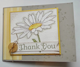
If you have My Digital Studio then you have loads of digital stamps to print out and use on all your paper projects. I have been using the digital stamps more and more lately, I just love that I can resize them, recolor them and crop them. Recently I've started printing out my stamps onto watercolor paper and using Aqua Painters to color them. Here is one that I did recently. On this card, I colored the stamp digital, but I also colored it with Aqua Painters after it was printed.
I printed this page out and cut apart all the separate pieces.
I zoomed in really close to color in the flower center.
MDS makes beautiful handmade cards. I love using my traditional craft tools with my digital designs. I hope you will give this a try!
Thanks for stopping by!
I printed this page out and cut apart all the separate pieces.
I zoomed in really close to color in the flower center.
MDS makes beautiful handmade cards. I love using my traditional craft tools with my digital designs. I hope you will give this a try!
Thanks for stopping by!